Process/UX

Gears image

1. Purpose, Understanding, Requirements.

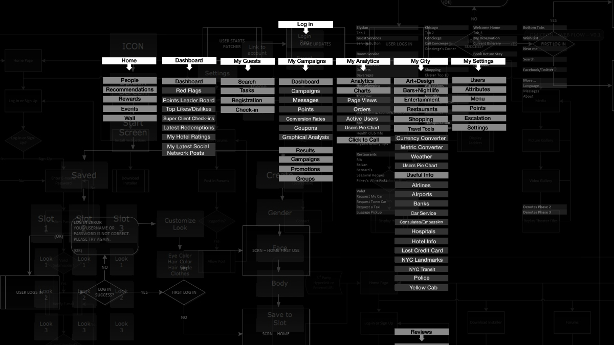
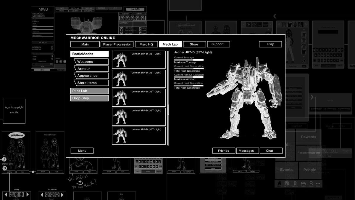
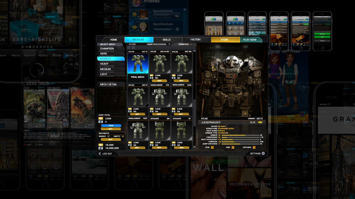
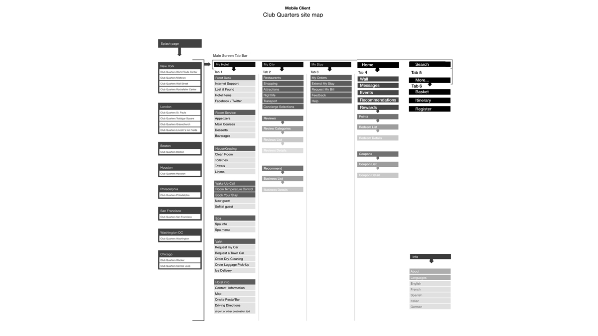
This is where it starts. Gather information about the project. Try and get enough information to understand the scope of the problem.
- Develop an understanding of the needs and interests of the individuals using the interface.
- Try to anticipate pain points and important touchpoints.
- Generate as many ideas as possible, looking at the issues from all angles.
- Identify opportunities from the information that has been gathered.
- Research possible solutions by identifying the best practices in similar projects.

Gears image

2. User Flow, Site Maps.

Begin to gather and organize your ideas creating simple user flows.
- Identify the main tasks and begin to link them together in a sequence of events.
- Keep the user flows clear and concise so the user can flow through the interactions smoothly.

Gears image

3. Information Architecture, Wireframes.

The process can now shift to organizing individual screens from the gathered information into heirarchies.
- A clear heirarchy is important for strong information architecture and is effective in providing intuitive page navigation resulting in a good experience.
- Wireframing helps to quickly allocate and distribute the information and content in the defined space.
- Wireframes can quickly define the priority of the content and determine what functions are available and how they behave.

Gears image

4. Mock-ups, Prototypes.

Once the information architecture has been established we move onto styling the content.
- color, spacing, padding, typography, iconography and animation.
- Use strict rules when applying these elements to maintain consistency and help strengthen the heirarchy of the content.

Gears image

5. Test, Evaluate, Iterate.

The interface should operate as intended. Observing how someone interacts with the interface will help identify any broken interactions and confirm that it is easy to navigate. It will also confirm if the intended information architecture is intuitive, and is a great way to eliminate any user issues or problems that was missed during the previous design phases. Any user problems can now be addressed before the final implementation.


Mobile Rewards Flow UX/UI

Gears image

Mobile Site Map

Mobile site map to help identify requirements and understand the general flow of the UX.

Gears image

Mobile Rewards Flow

Mobile rewards flow UX

Gears image

Mobile Home Screen UX

Mobile UX identifying the main elements of the mobile home UX navigation.

Gears image

Mobile UX Dimensions and Location

Mobile UX identifying the pixel dimensions and location of the main elements of the UX to help the engineers with the layout.


Gears of War UE War Journal

Gears image

Gears of War Ultimate Edition - War Journal

War Journal screen flow.

Gears image

Gears of War Ultimate Edition - Collectible Selection and Viewer

Collectible selection and viewer flow.


Mechwarrior Online Store UX/UI

Gears image

Mechwarrior Online Store UX/UI

Mechwarrior Online store and shopping cart UX/UI.


Mobile Avatar Creator

Gears image

Mobile Avatar Creator Wireframe Flow 1.0

Initial wireframe created to resolve the UX flow and help identify any deficiencies.

Gears image

Mobile Avatar Creator Wireframe Flow 2.0

Revised wireframe created to resolve the UX flow and help identify any deficiencies. The layout and content heirarchy is becoming more final and ready for an initial art pass.

Gears image

Mobile Avatar Creator Art Pass 1.0

Initial art pass incorporating colour and style. We also think about how the elements are behaving as the user interacts with the UI.


Prototype 2 Style Boards

Gears image

Prototype 2 Style Board - Colour

A style board to help communicate the initial use of colour to the rest of the team or clients. It is easier for the client to actually see the intended use of colour than try to describe it with words.

Gears image

Prototype 2 Style Board - Typography

A style board to help communicate the initial use of typography to the rest of the team or clients. It is easier for the client to actually see the intended use of typography than try to describe it with words.

Gears image

Prototype 2 Style Board - Style Elements

A style board to help communicate the initial use of additional style elements to enhance the presentation to the rest of the team or clients. It is easier for the client to actually see the intended use of these elements than try to describe it with words.